Atlantis Transportation Hub
A Data-Driven Environmental Display
Fall 2019
Team
Dana Frostig, Irene Lin
Role
UI/UX Designer
Methods
Data analysis, persona/stakeholder analysis, wireframing, prototyping
Skills
Figma, Keynote Animation, Adobe XD
Large environmental displays that engage members of the public must be highly readable and easy to understand. Data-driven displays appear in sports stadiums, transportation facilities, hospitals, or stock trading floors. They create value for these transient groups of individuals by displaying the right data at the right time.
The main goal is to create a clear data-driven environmental display that is placed in the Atlantis Transportation Hub. This display should promote the PTF pass, a transportation pass that allows flexible travel between the San Juan Islands. In order to achieve this goal, we needed to examine personas of stakeholders, empathize with them, and use them to inform design decisions. By analyzing a data set that contains flight, train and ferry information, we were able abstract the data and present it in a digestible way that not only creates value for the business owner but also creates value for the customer.
Final Design - The PTF Play Map
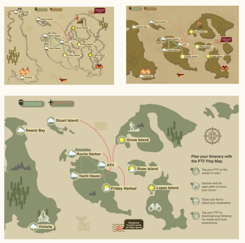
An environmental display that not only displays bulk plane, ferry and train information, but incorporates an enaging, gesture based interactive map that allows users the opportunity to create personalized itineraries.
The directions are simple:
Gestures
Users hold an open palm to the screen and the map registers the user.
Users create a fist to indicate selection.
Users wave goodbye or the interaction ends when the user taps their pass check out.
We wanted to emphasize the important of flexibility, convenience and itinerary planning. After the user selects their destination and taps their PTF pass to check out, a personalized email with travel information and suggested travel destinations are sent to their mobile devices.
Freedom to Choose Your Adventure
Users are presented with multiple generated itineraries based on their destination at the comfort of their own devices. They have the power to choose the itinerary that best suits their travel needs. Whether that's efficiency and speed or exploraton and deliberation.
We recognize that downtime between transportation can be some of the most unpleasant experiences, which is why we gave users an opportunity to explore local attractions and experiences at both their final destination and any transfer location.
Stakeholders

Elizabeth Duarte
Transportation Director of the Municipality of the Greater San Juan Islands, a division of the local government that operates Atlantis Hub.

George Shimko
A long-time resident of the San Juan Islands, George Shimko is an avid outdoorsman who owns modest fishing cabins on nearby Orcas Island and Stuart Island.

Patrick Mulvaney
An environmental engineer for a EnCo, a large energy company in the region. Patrick spends an average of three days per week visiting drilling and wind power sites throughout the San Juan Islands.
Stakeholder and Data Analysis
Looking at the stakeholders, we first mapped out both individual and overarching needs. The next step was to organize travel data, displayed at the transportation hub, based on the stakeholder's goals.
The overlapping goals included flexibility, ease of travel and itinerary planning
Using an Excel sheet of travel information - time tables for planes, trains and ferries at the Atlantis Transport Hub and at other ports, we first looked to clean the data and look for any transportation patterns. We then created a current and future model of the transportation hub.
From the stakeholder and data analysis, we gathered some important design directions.
Emphasize "Destination" at the highest level of importance.
Create a display that is suits the stakeholder's needs: flexibility, efficiency and itinerary plannng.
Ideation
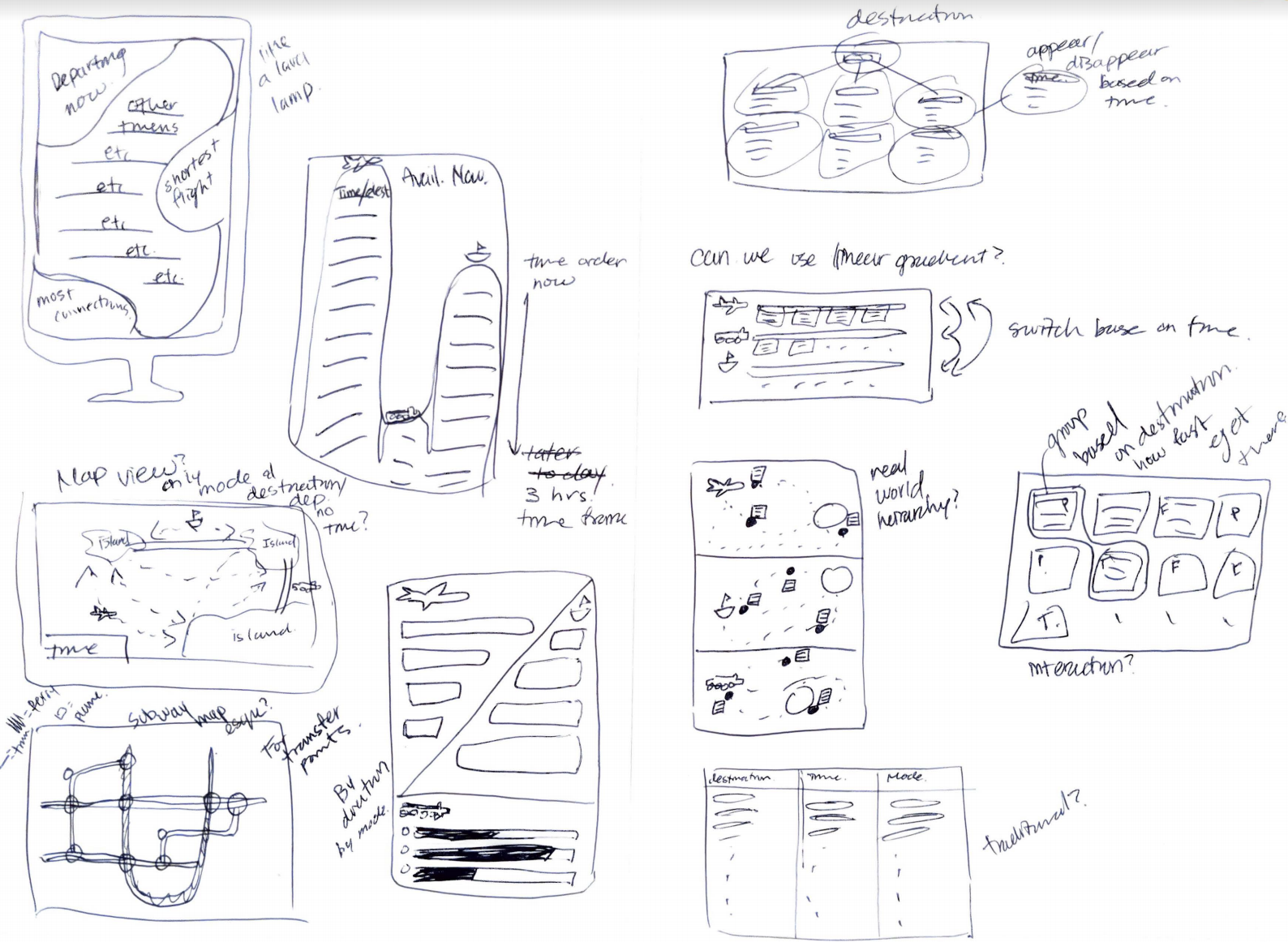
After generating an idea of what type of information we want to present as well a the hierarchy we want to present it in, the next step was brainstorming ideas.
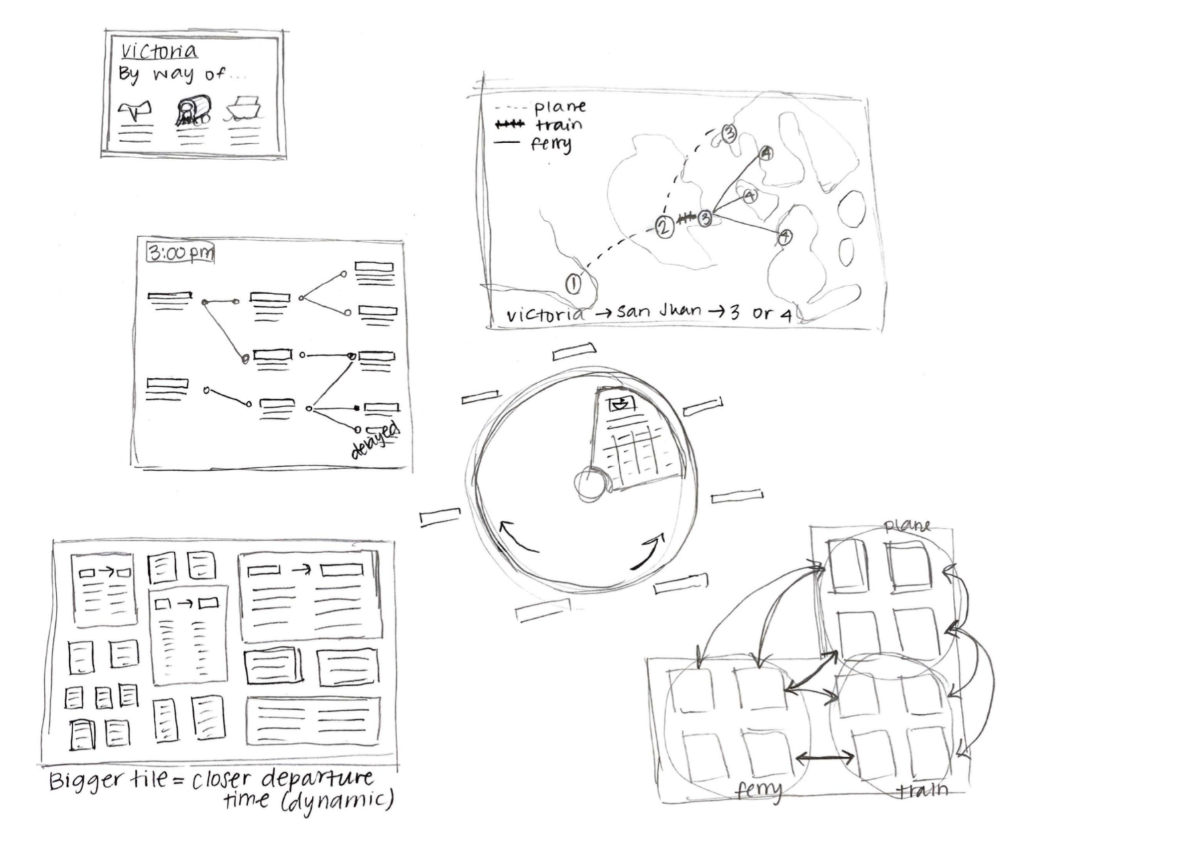
We rapidly sketched many ideas about how we can display travel information to the users. We were able to explore a breadth of different types of data visualizations. This step was crucial in helping us figure out what elements of certain sketches we liked, as well as certain elements we didn’t like.


Iteration 1
We knew we wanted to incorporate a map, to help those using the display quickly be able to visualize their routes and itineraries
We determined that destination was the most important element of the display, when we created the future state model of the information architecture of the display.
Therefore, we paid close attention to the organization & hierarchy of the data for the first iteration. For trains and planes, the direct modes of transportation from ATH, we wanted to highlight data by destination. For ferries, we wanted to highlight connecting routes from those destinations.
To address the stakeholder's need: flexibility, we illustrated the ease with which one can transfer from plane to train to ferry on the map. By visually representing the various routes and transit hubs, users can plan their itineraries.
Iteration 2
For our second iteration we wanted to further emphasize the PTF pass.
We first asked ourselves: What is the PTF Pass?
We decided that the PTF pass allows for ATH customers to easily create custom/flexible itineraries among the different destinations around the San Juan Islands. The pass also eases access to the different modes of transportation (tap on/tap off, reserved seating, etc.).
How does the PTF pass influence our design?
We wanted customers to feel as though they could travel like locals - this is reflected in the display with an easy to use map, simple data organization and neutral colors. We also wanted to help customers make travel decisions, by showing them information about the different destinations, such as weather and activities information.
Iteration 3 - UI Decisions
After gathering feedback about our previous iteration, we decided to try two new variations of our NW map that drew on elements from pirate maps and cartography drawings.
User Testing Results:
Pirate and cartography elements were playful and visually interesting
Pirate and cartography elements distracted from the important info map needed to convey.
Takeaway:
While having a unique perspective can differentiate our design from a crowd aesthetic flare should ultimately serve the goal of our display not distract from it.

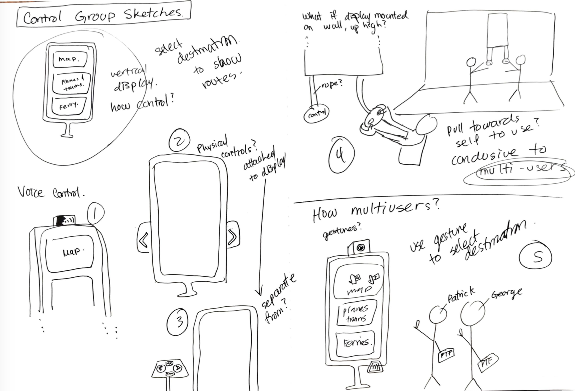
Exploring Interaction
Voice Control
Using voice to select a destination on the map
Physical Arrow Controls
Using two large arrows keys attached to display to toggle through destinations
Physical Console Control
Using a separate console to toggle through destinations
“Multi-Player” Console Control
Using attached game controller-esque controls to select destinations
Gesture Control
Using gesture-based system to select destination

Ultimately we chose to use a gesture-based system which will support multiple users exploring the map.
Iteration 4
For this iteration we focused on motion. How do we display information on the display in a digestible way. In order to reduce the cognitive load on users, we decided to only display one hour time slots. Over time, the display dynamically changes to accomodate for future flight, train and ferry information within the one hour time frame.