Gaveler
Summer 2019
Team
Solo Redesign
Role
UI/UX Designer
Methods
Competitive analysis, user research, user testing, wireframing, prototyping
Skills
Adobe Photoshop, Adobe XD
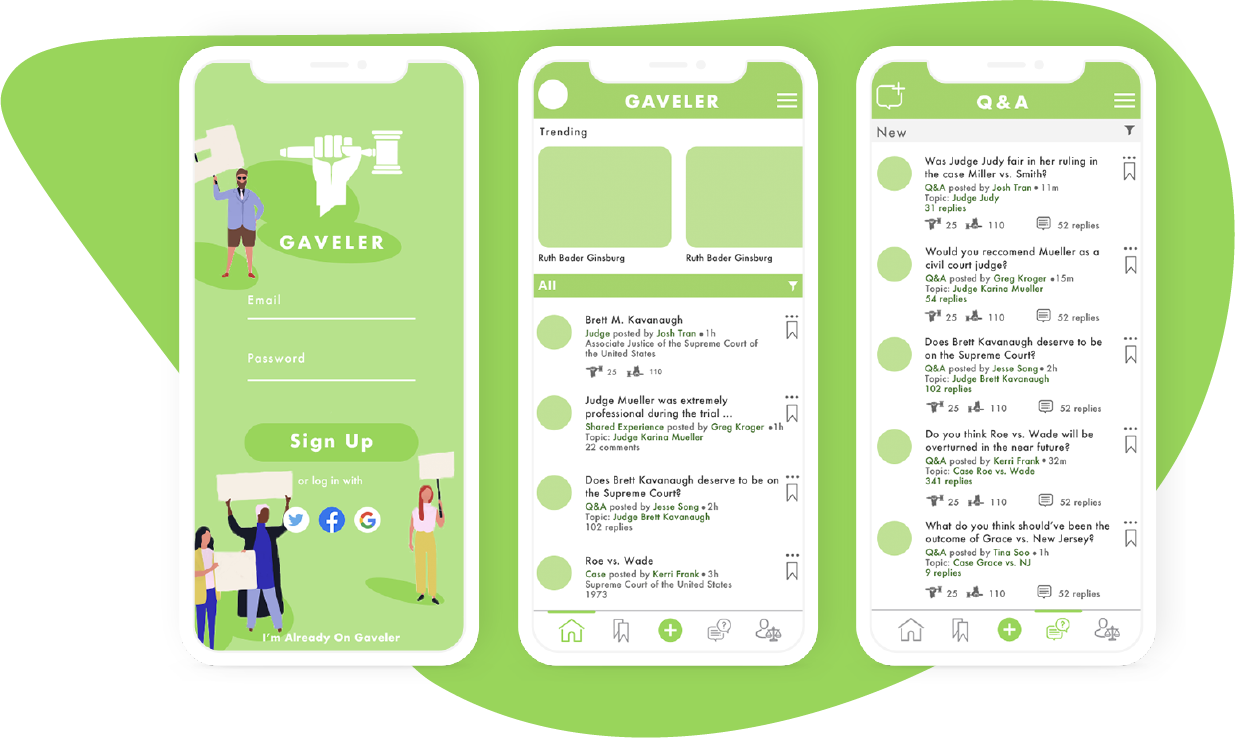
Many people know about the Brock Turner case, but how many people know who the acting judge was? Who was the person responsible for the ruling? Let's say you have a hearing with a judge at your local county court for a traffic violation. Would you want to see other people's experiences with this judge? Whether or not they were fair and respectful?
At Dog and Rooster, I worked on redesigning a current in-house app called Gaveler. The idea behind the app was to help users share their experiences about judges and cases. Currently, there isn’t a way for people to effectively express their opinions. Sure, there are applications like Yelp, that allow users to rate restaurants and establishments, but judges are rarely under scrutiny and critique by the general public.
Final Redesign
Redesign was focused on streamlining the user experience and usability of the application.
Major Changes
Research - Big Questions
Why would a user care about judges?
What type of information would users be looking for?
Stakeholders? Opiniated? Educated?
How do we maintain a user base?
What experience are they looking for? Exploration? Community?
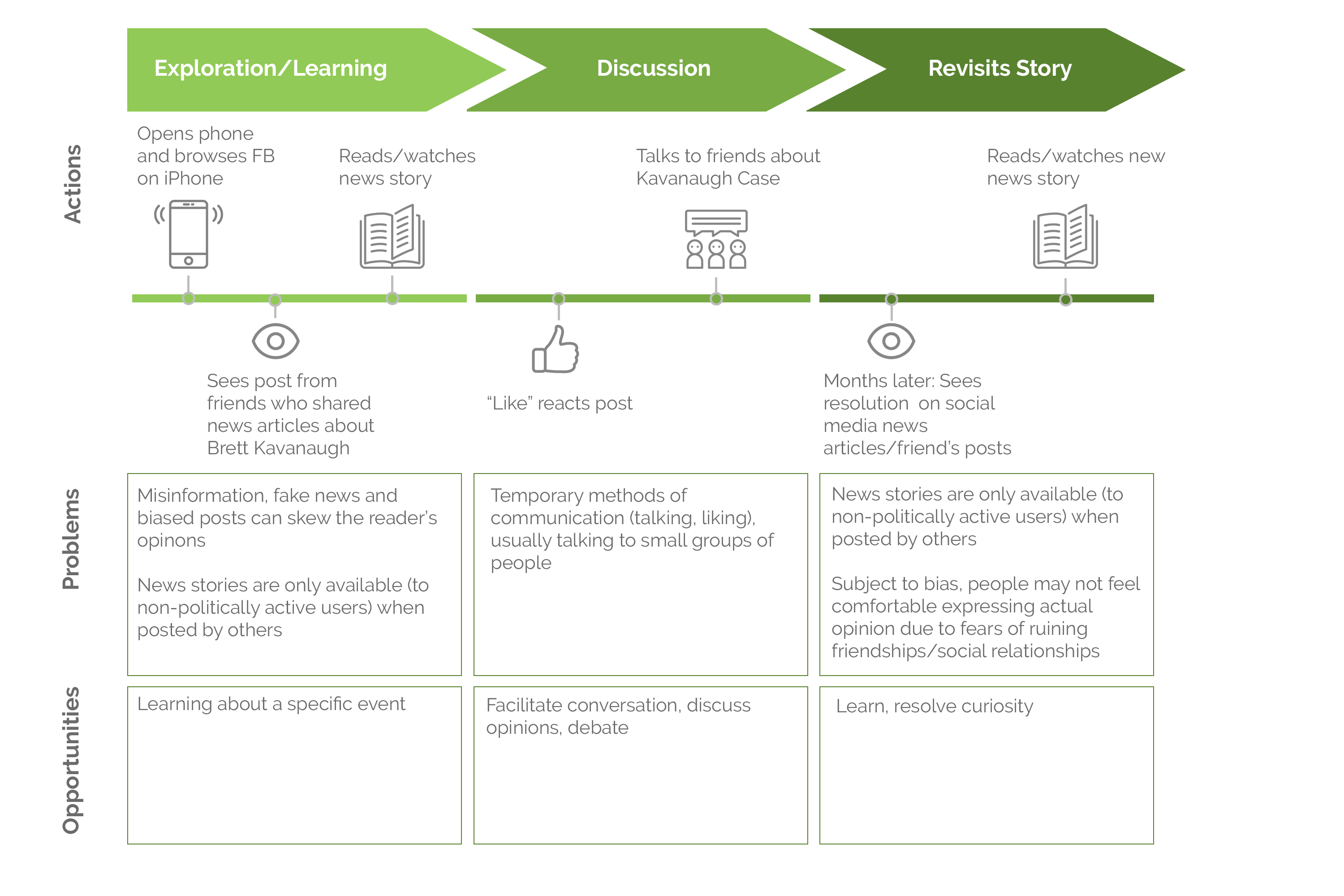
Research - Journey Map
To understand how people currently intake political news.
The Users

People who want to read and educate themselves about judges and cases.
.png)
People who want to express excitement/unhappiness after a court hearing

People who are politically charged and want to discuss judges/cases
Competitive Analysis
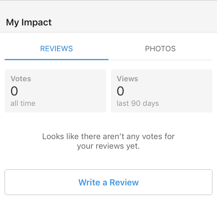
What's currently out there? What are some exemplars of applications that have rating features?
| Experiences | Stakeholders? | Why Return? | Features that support experience | |
|---|---|---|---|---|
| Yelp |
|
|
|
|
|
|
|

|
1 on 1 Interviews
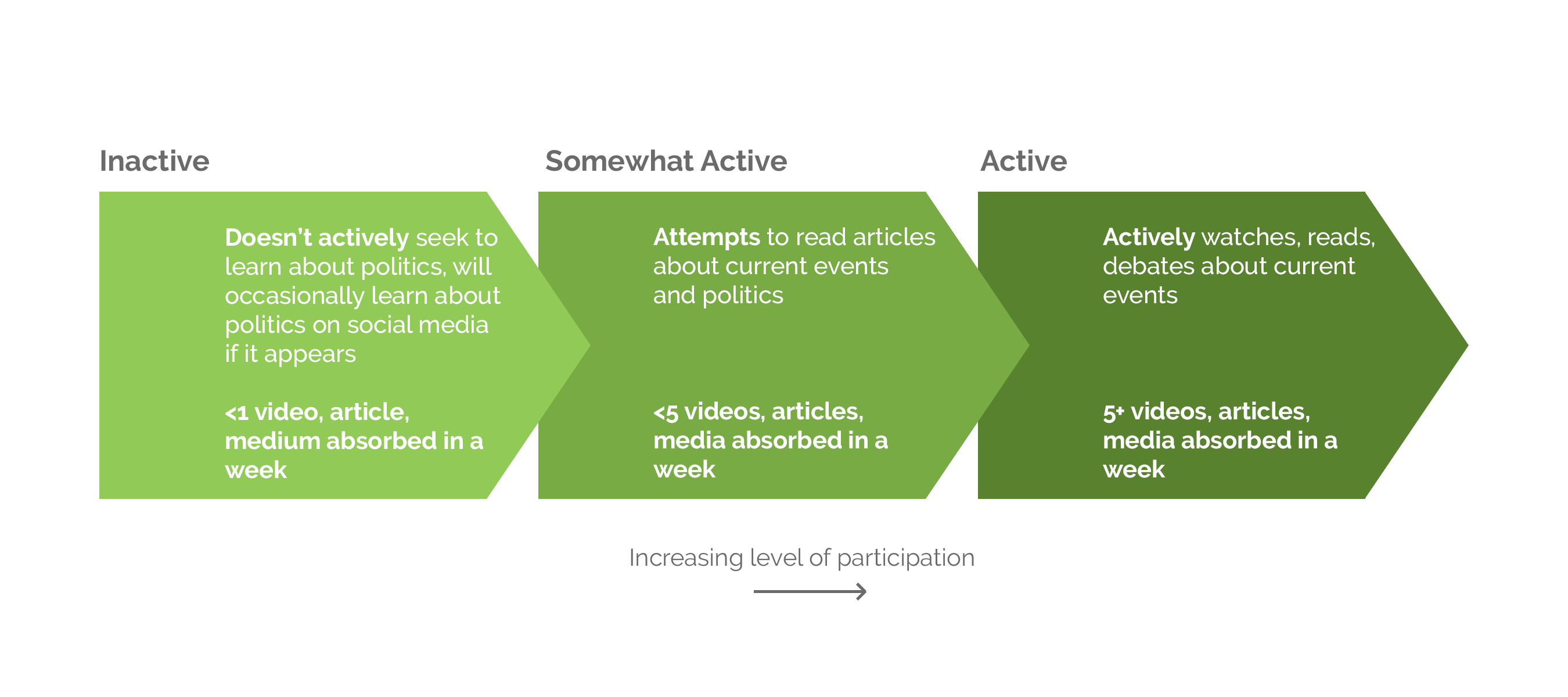
I interviewed people who ranged from politically inactive to politically active. The term “politics” is referring to current events related to the judicial system. I defined each category by these metrics:
Key Insights
Resdesign Goals
I focused on three main goals/actions I wanted the users to do:
01 View
02 React
03 Post
From the competitive analysis and interviews, I created a list of improvements I wanted to make and categorized them based on which action/goal it would help achieve.
01 View
More categorization by hottest, trending, controversial, in the news, etc. to engage interest and help retain user base
Entirely new section for shared experiences (more like a feed)
Onboarding - Username, photo, add to collection, political affiliation, age
02 React
Entirely new section for shared experiences (more like a feed)
Q&A section where users can ask other users questions about specific judges/cases - A way to give advice, elaborate on a shared experience, develop repertoire between users, just chat
03 Post
Create a more pleasurable posting experience - Currently a lot of steps users must take
Create and post Shareable collections (rather than a private watchlist)
Lo-Fi Prototype
.png)
.png)
Iteration 1
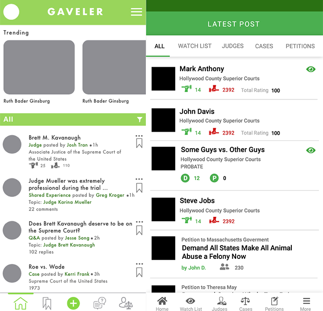
Home Page
Updated menu bar with posting "+" button emphasized
Trending judges/cases displayed on top to engage user interest
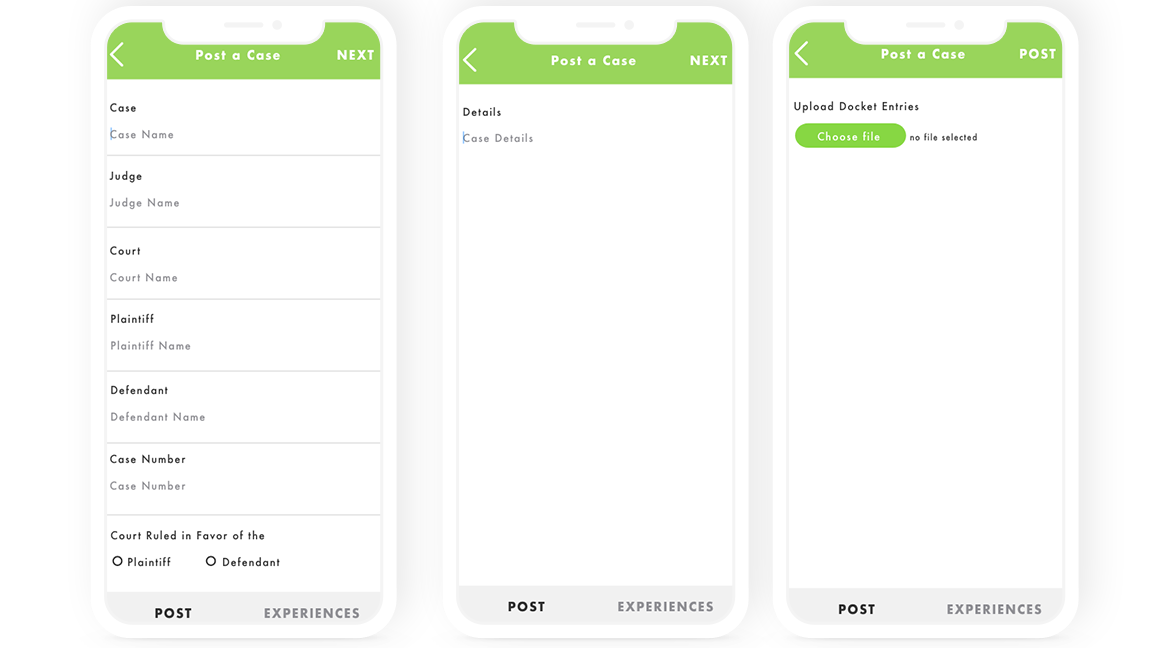
Posting Process
Three step, open text, streamlined process that allows users to skip unknown inputs
Seven step process that forces users to indicate case type, many of which are highly specific and use nuanced language that not all people would easily understand
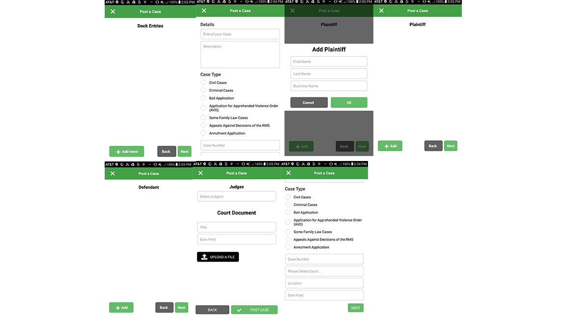
Major Changes
User Testing
In order to make sure that the prototype fit the needs of the users, I created a list of tasks I wanted the users to focus on and led think-aloud protocols for each of the user testers to see where they struggled/found success. Mapping out user flows helped me understand which interactions needed to be fixed.
Key Insights
01
Posting process is inconsistent. When tasked with posting an experience/Q&A, they were confused about where to go.
02
What exactly is a shared experience? Can anyone post a shared experience? Users didn’t understand who could post a shared experience/if there was a strict process to verify that the user actually interacted with the judge.
03
Users were confused about the judge/case icon on the bottom banner but were able to discern all other icons.
Final Product
Using the feedback I got from user testing, I fixed three main things:
All other features and pages remain the same.